
A UI animation video rebuilds your product's interface and shows it in a few clear states instead of playing back a real screen recording. You cut your dashboard down to one workflow, a few columns and one result. Between the states, a cursor, camera moves and counting numbers guide the eye. With a prompt, an AI like Claude can build that interface as code, so text and numbers stay sharp in every frame.
A UI animation video shows your software the way people should understand it, not the way it looks on a busy Tuesday. Instead of a screen recording with loading spinners, crowded menus and tiny numbers, you get a clean interface that moves with intent: a table fills up, a number counts up, a cursor clicks the one button that matters. This guide explains when this approach pays off, how to simplify your dashboard for it and how to plan the motion so people get it the first time they watch.
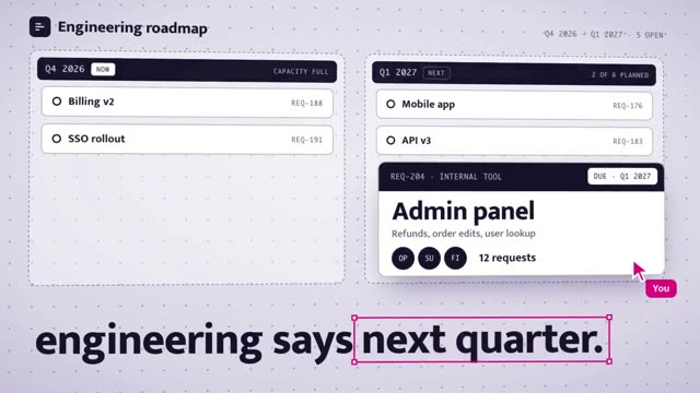
The video above is “Schemata” from the DrillUp library. It is an 11 second film in 16:9 for a made up tool that lets teams build their own internal tools. It does exactly what this article is about. An admin panel is put together from building blocks, gets connected to data and ends up being used by several teams. Not a single shot in it is a screen recording.
Screen recording, video model or rebuilt UI?
If you want to show your software in a video, you have three options. Each one has its place, but the results are very different.
| Screen recording | Video modeltext or image to video | Rebuilt UIanimated as code | |
|---|---|---|---|
| Text and numbers | sharp, but often tiny | can shift from frame to frame | sharp in every frame, any size you want |
| Data | needs real or test data | made up by the model | you set every number yourself |
| Motion | as fast as you click | hard to control exactly | every move planned to the frame |
| Changes later | record again | generate again, different result | change the text or number in the prompt |
| Good for | tutorials, App Store | mood shots without text | website, ads, launches, social media |
A screen recording is honest and quick to make. For a tutorial it is often the best choice, because viewers see exactly what they will click later. For marketing it is rarely strong. Too much happens at once, and on a phone the text is hard to read.
Video models are great at light, people and places. An interface full of tables, amounts and names is hard for them, because every frame is painted again. We explain why text and logos slip in that process in AI video garbled text.
A rebuilt interface is the route many software launch videos take. It used to mean long hours in an animation program. Today an AI like Claude can build the interface as code from a long prompt and render it as a video.
A UI animation video is made of states
Here is the most useful idea for planning: a good UI video is not a chain of clicks. It is a short sequence of states. A state is a frame you can read calmly. The motion between two states explains how you get from one to the next. Schemata has four of them:
- State 1Empty canvasblocks on the left, space on the rightMove: a table is dragged in
- State 2Block in placetable with empty rowsMove: the database is connected
- State 3Data arrivesrows, a key number, a chartMove: the camera pulls back
- State 4Tool in useseveral teams click at onceThen: logo and closing line
Based on: the film Schemata from the DrillUp library, 11 seconds, 16:9. Before it comes a problem (the tool is planned for next quarter), after it the logo and tagline.
When you plan your own video, write these states down before you think about motion. Three to five are enough for a short film. Ask one question for each state: what should the viewer understand in this frame? If you cannot answer in one sentence, the state is either unnecessary or too crowded.
How to simplify your dashboard for video
Your real dashboard is built for daily work. In a video it has a different job. It has to show one benefit in a few seconds. So you remove almost everything that does not serve that benefit.
- One workflow per video: Show one task from start to finish, such as “create an invoice” or “share a report”. Nobody remembers five features in ten seconds.
- Fewer columns, bigger text: Twelve columns become three or four. The text can be much larger than in the real app, because many people will watch on a phone.
- Hint at navigation: Keep the sidebar and header so people recognise the product. The menu items do not need readable labels.
- Believable sample data: Real customer data does not belong in a video. Make up names and amounts that fit your industry. Uneven numbers like 1,284 look more real than 1,000.
- Match your brand exactly: Font, colours as hex values, corner radius and spacing. The more precise these details are, the more the rebuild looks like your product and not like a template.
A simple test: take a screenshot of the finished state and look at it on your phone at normal size. Can you tell what it is about within two seconds? Then the simplification works.
Motion people understand: cursor, camera, numbers
The actual animation happens between the states. This is where a video either feels premium or rushed. Three tools carry almost every good UI video.
The cursor as the main character. A cursor gives the eye something to follow. It should travel in soft arcs, slow down just before the target and only then click. In Schemata it carries a small “You” label, and later more cursors with team names join in. Without a single word, the film tells you that a tool for one person has become a tool for several teams.
The camera guides the eye. Instead of showing the whole window all the time, the camera moves to where something is happening and then pulls back. A slight tilt of the interface in space adds depth without making the frame restless. Every move needs a reason. A camera that moves just because it can is a distraction.
Numbers that move. A key number counting up from zero, or chart bars growing one after another, shows impact faster than any sentence. Let the number rest at the end so people can read it.
Add one rule that many people underestimate: pauses. Every state needs a moment of calm before the next thing starts. If everything moves at once, nothing gets seen.
An example prompt for your dashboard
This is what the start of a prompt for one short scene can look like. It covers format, content, states and one rule for readability:
16:9, 1920 × 1080, 60 fps, 12 seconds. Rebuild my dashboard (screenshot attached), but only the sidebar, a revenue table with 5 rows and one key number. Sequence: empty table, rows appear one by one, the key number counts from 0 to 1,284, a cursor clicks “Export”, the camera slowly moves in on the key number. Font Inter, accent #5B5BF0. Each state holds still for at least 1 second.
A prompt this long gives you a first draft. A film like Schemata needs a lot more: exact timings for every move, curves for cursor and camera, rules for shadows, sharpness and sound. That work is what goes into the long prompts in AI Prompts. You pick a video that is close to your goal, copy the prompt and swap the content, data and brand for yours. The DrillUp Academy shows you how to do that step by step.
Where a UI animation video works best
Most often this kind of video sits at the top of a software homepage, where it shows in a few seconds what the product does. It works just as well as an ad, as a launch post or as a short film for a new feature. How to show a single update in 15 seconds is covered in feature announcement video, and the structure of a full launch film is in SaaS launch video with AI.
There is one exception: the App Store preview video. According to Apple's app preview guidelines, previews must use footage captured on device and show only content from within the app (as of 7 November 2026). A rebuilt, animated interface does not fit there. What the store allows is covered in App Store preview video. The rule does not apply to your website, social media or ads.
If you do not want to start from zero, look at the films in the library that show an interface, such as Schemata. They show how the states are built and how the motion runs between them, before you turn one into your own film.
Frequently asked questions
What is a UI animation video?
A short video that shows the interface of an app or software product, but not as a screen recording. The interface is rebuilt in a simpler form and animated on purpose: elements appear, numbers count up, a cursor clicks and the camera moves in on the important parts. Viewers understand what the product does in a few seconds.
Do I need real data for a dashboard video?
No, and usually you should not show it. Real customer data does not belong in a marketing video. Made up names and amounts look just as real if they fit your industry and are not too round.
How long should a UI animation video be?
One feature often needs only 10 to 20 seconds. A full product overview usually runs 30 to 60 seconds. More important than the total length is that each state stays on screen long enough to read.
Can I use a UI animation video on the App Store?
Usually not as an app preview. Apple asks for footage captured on device that shows only content from within the app. For your website, ads, social media and launch posts, a rebuilt and animated interface is common.
Why not just use a video model?
Video models generate every frame from scratch. With lots of small text, tables and numbers, details can shift from one frame to the next. An interface built as code is only moved, never repainted, so every letter stays in place.